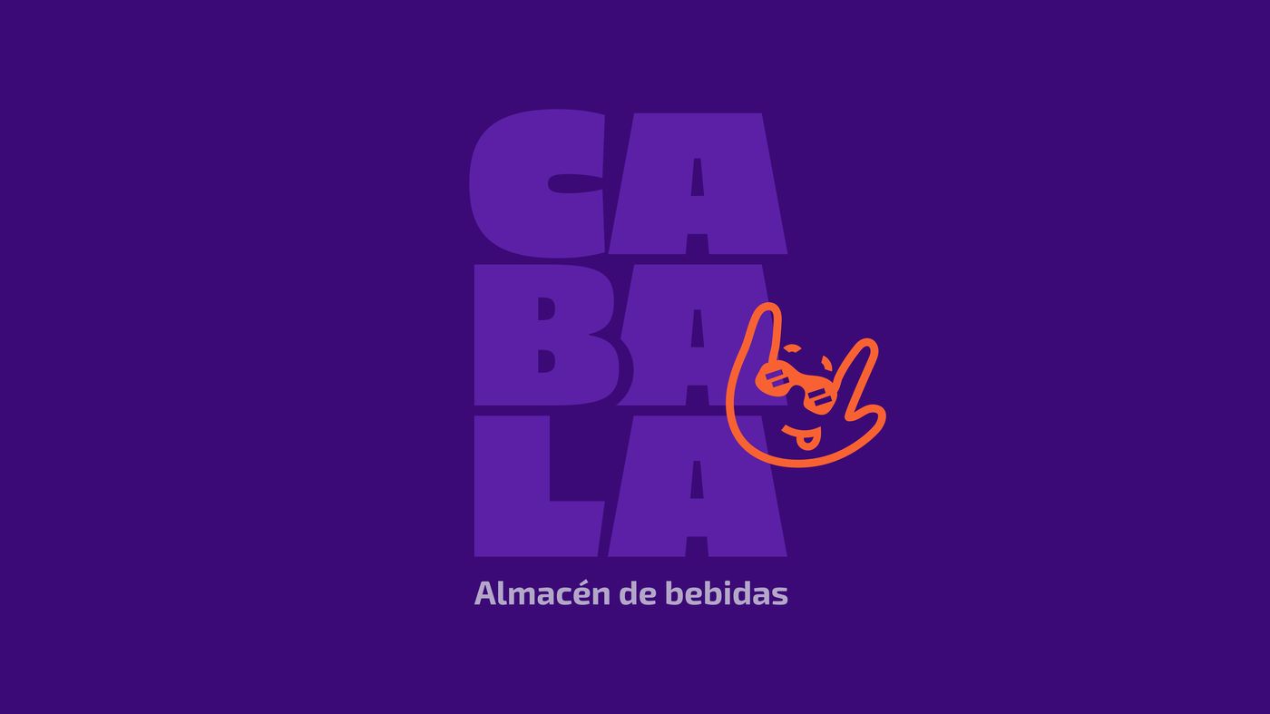
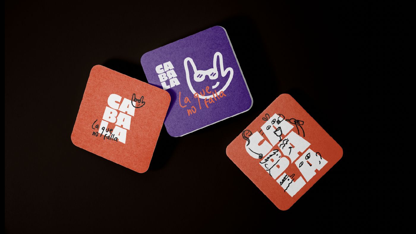
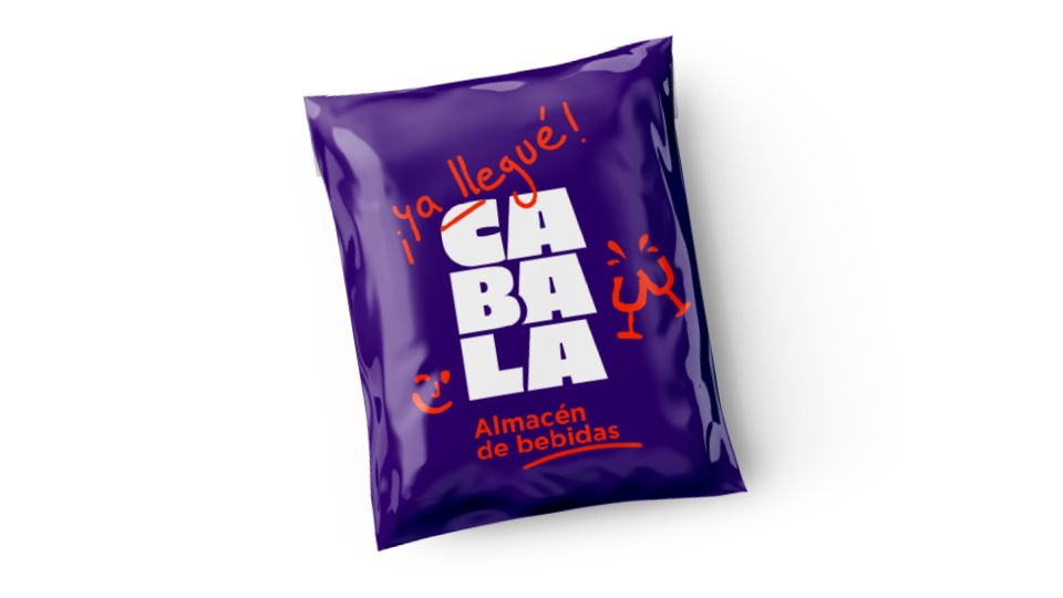
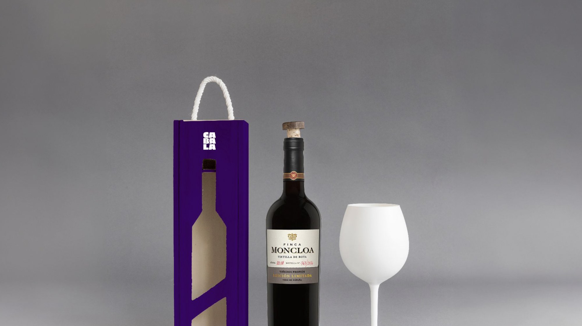
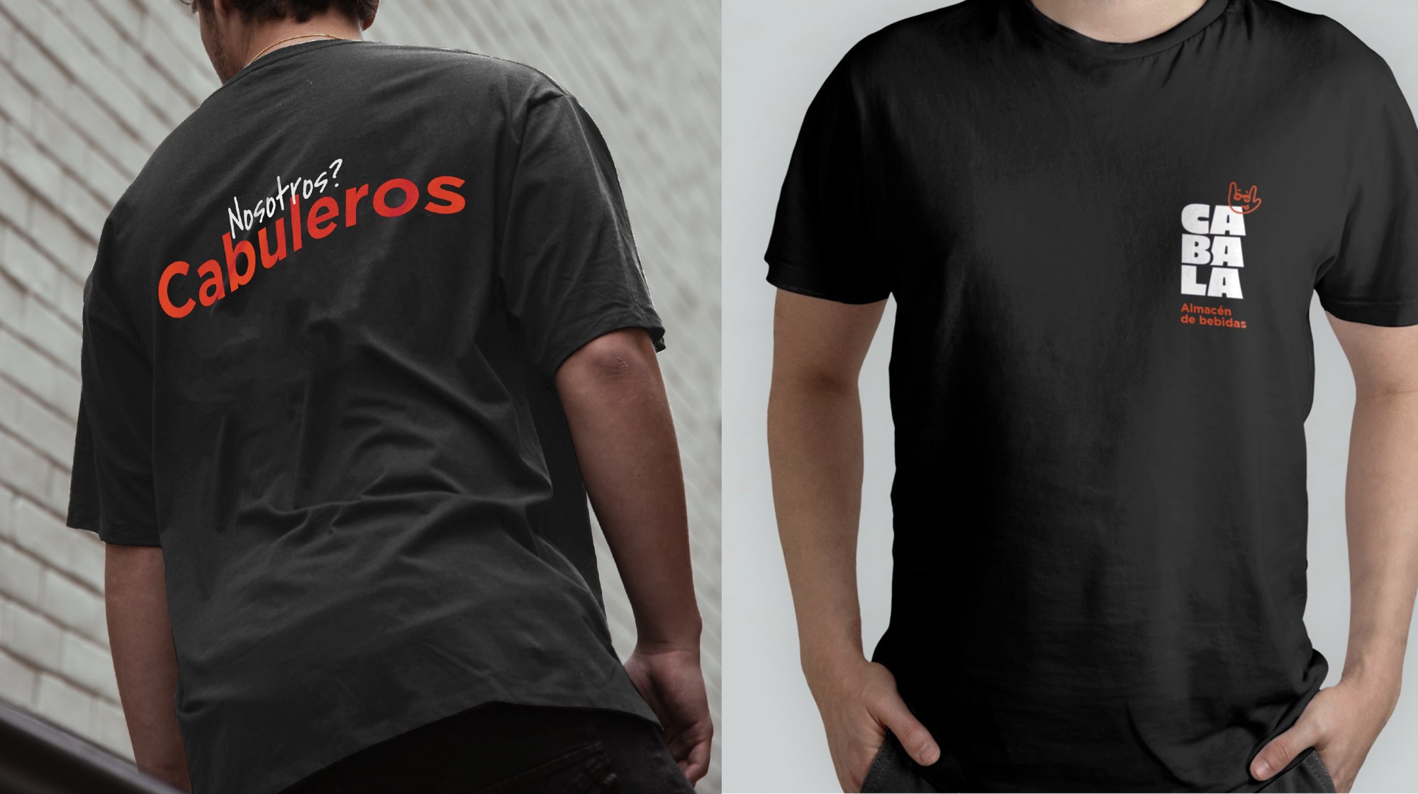
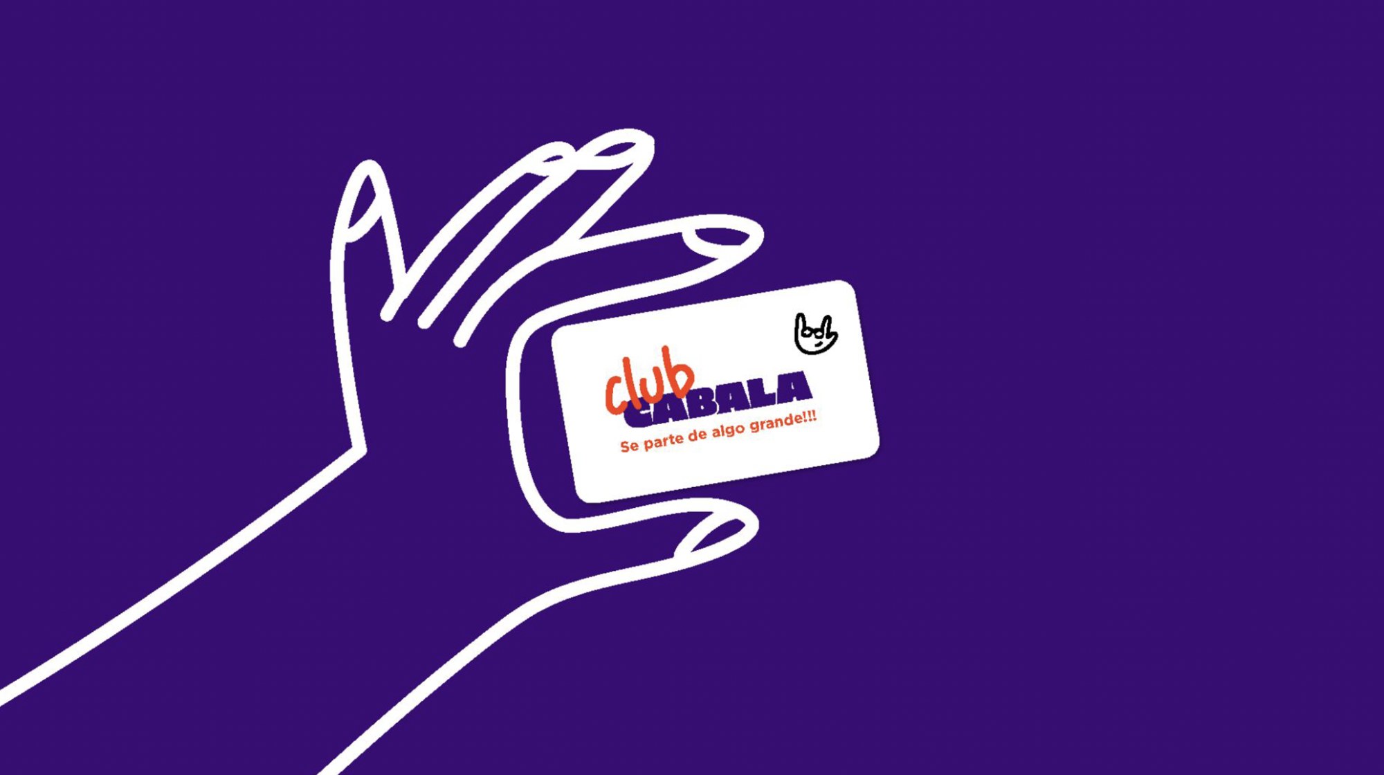
A brand identity for a local beverage store, built with the confidence of a brand twice its size. The challenge was to give a neighbourhood shop a bold, memorable personality that would stand out and feel like a place you trust: “la que no falla”.
The system is built around a heavy, expressive logotype and a playful hand-drawn mark, in a bold purple and orange palette. Applied across coasters, packaging and communication, the result is a warm, confident brand with attitude, that turns a simple errand into something with character.